Civ 7 UI: Bad as Rumored?
- By Jason
- May 21,2025

The Deluxe Edition of Civilization VII has only been available for a day, yet the internet is already buzzing with criticism, particularly about its user interface (UI). But is the backlash justified? Let's dive into the specifics of Civ 7's UI to determine if it truly falls short of expectations.
← Return to Sid Meier's Civilization VII main article
Is Civ 7's UI as Bad as They Say?
Civilization VII has just been released for Deluxe and Founder’s Edition owners, and it's already facing criticism, especially for its UI. While it's easy to join the chorus of detractors, it's crucial to evaluate the UI objectively. By examining its components, we can determine if it meets the standards of a functional 4X game interface.
What Makes a Good 4X UI?
Designing a 4X game UI is complex, as what works well can vary based on the game's specific needs and style. However, experts have identified key elements that tend to enhance the user experience across most 4X games. Let's assess Civ 7's UI against these benchmarks.
Clear Information Hierarchy
A good UI organizes information so that the most important gameplay elements are easily accessible. In 4X games, essential resources and mechanics should be prominent, while less-used features should be just a few clicks away.
For instance, Against the Storm's building info menus exemplify a clear information hierarchy. Each building's menu is organized into tabs, prioritizing common actions like worker assignment and production settings, while less frequent actions like inventory management are neatly tucked away.
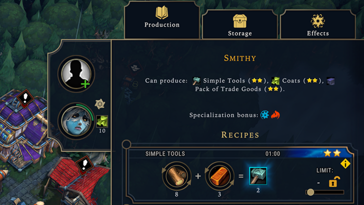
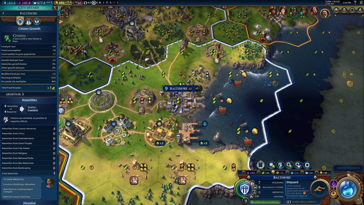
Civ 7's resource management UI is functional but could benefit from more detailed information. It provides a summary of resource allocation across the empire, with breakdowns by district and city. However, it lacks specificity about which hexes or districts produce certain resources, and the expense breakdown is limited to unit upkeep. While not ideal, it's serviceable and could be improved with more granular data.
Effective and Efficient Visual Indicators
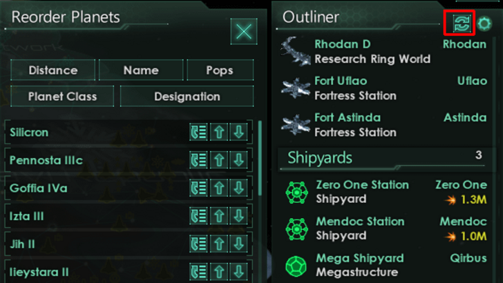
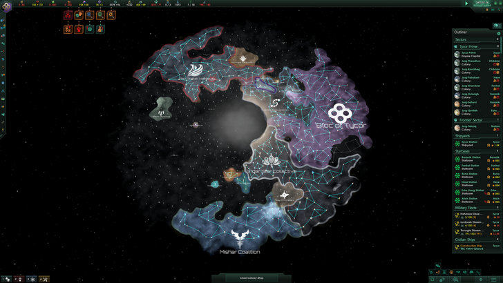
Visual indicators like icons and color coding are vital for quick information processing. Stellaris's Outliner uses visual cues to show the status of survey ships and colonies, reducing the need for excessive navigation.
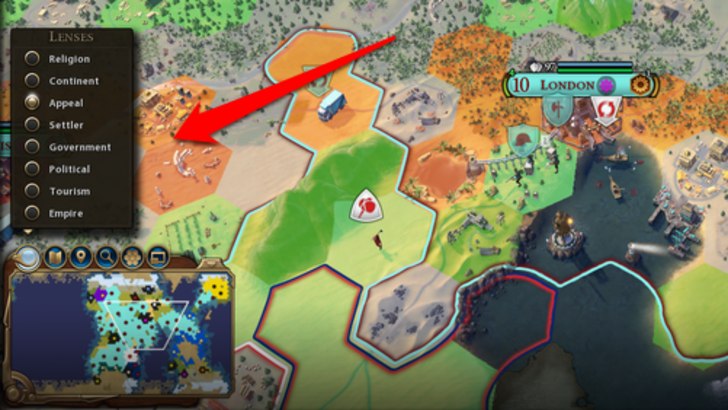
Civ 7 employs iconography and numerical data for resources but also includes useful visual indicators like the tile yield overlay and settlement viability color-coding. However, it lacks some of the visual aids found in its predecessor, such as certain map lenses. While not perfect, Civ 7's visual indicators are functional and could be enhanced with more options.
Searching, Filtering, and Sorting Options
As 4X games grow complex, tools like search bars and filters become essential for managing information overload. Civilization VI's search function, which highlights specific map elements, is a prime example of effective usability.
Civ 7's notable omission of this search function is a significant drawback, especially given the game's scale. This absence hampers usability and is a major point of contention among players. Hopefully, future updates will address this issue and enhance the Civilopedia's navigation.
Design and Visual Consistency
The UI's design and consistency can greatly influence player satisfaction. Civilization VI's UI complements its cartographical theme, enhancing the overall aesthetic experience.
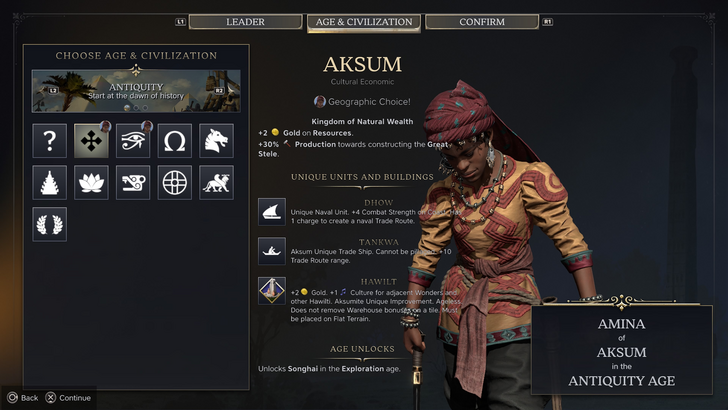
Civ 7 adopts a more minimalist and sophisticated design, using black and gold to convey regality. While this choice aligns with the game's aesthetic, it may not resonate as strongly with all players due to its subtlety. The UI's design is subjective, and while some may find it less engaging, it's not poorly executed.
So What’s the Verdict?
It’s Not The Best, But Undeserving of Such Disapproval
In conclusion, while Civ 7's UI has room for improvement, it's not as flawed as some claim. The absence of a search function is a significant oversight, but the UI's other elements are functional and align with the game's design ethos. Compared to other pressing issues within the game, the UI's shortcomings are relatively minor. With potential updates and player feedback, Civ 7's UI could become more refined and better received.
← Return to Sid Meier's Civilization VII main article
Sid Meier's Civilization VII Similar Games

Latest News
more >-
- Battlefield 6 Cuts MCOM Timers 33%
- May 03,2026
-
-

-

-

- "TMNT: The Last Ronin" Release Date Announced
- Apr 21,2026